Carphone Warehouse (2014)
Research, design and delivery for a SaaS application
Responsive web application for selling home & mobile broadband, phone and TV deals in Carphone Warehouse and Curry’s PC World stores.
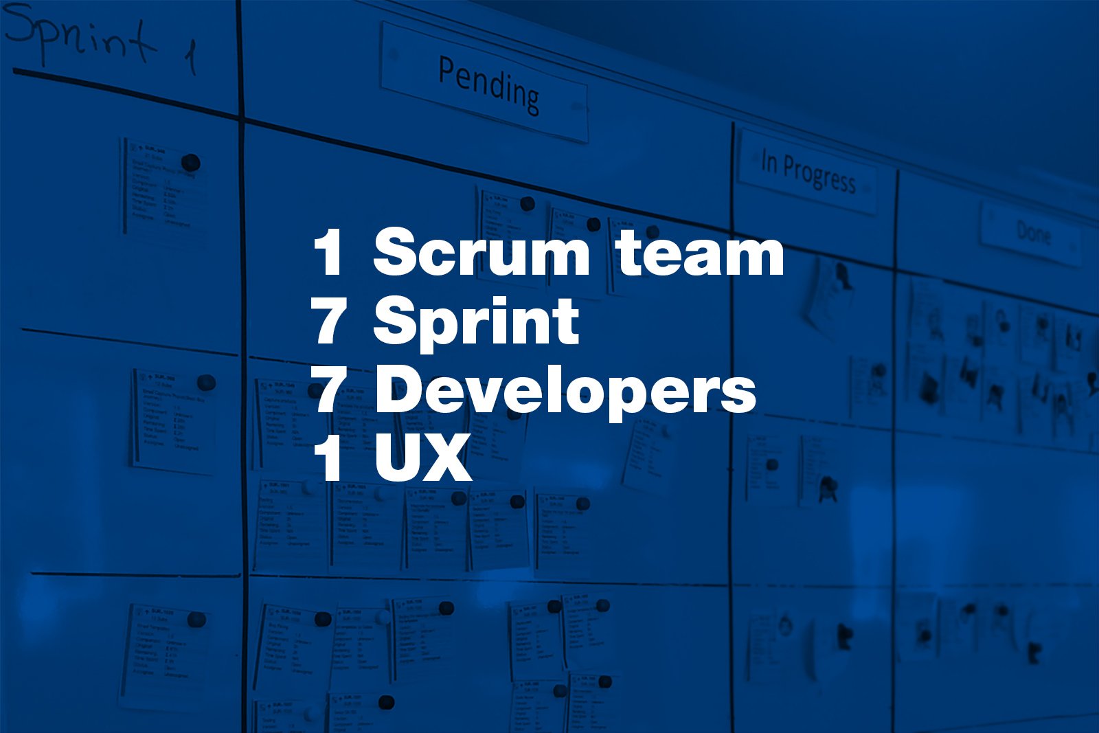
I was working closely with our Retail team, Product Manager and 7 developers during a four month Agile development.
👩💻
Design activities
Research
Information Architecture
Concepting & wireframing
Visual & Interaction design
Developer support
Made in 🖌️ Adobe Indesign and Photoshop
Brief
We had a minimal, form based web application for the initial launch put together by developers without any UX input. It was hard to use, made the selling process difficult and time-consuming and we've had constant complaints from in-store agents, but the main scope for 2.0 launch was to make the application tablet first responsive, so customers can also use it in stores without assistance. Plus we had to add a new vertical to the system to allow agents to sell mobile broadband deals via the application.
The target audience varied from digital savy youths to non-technical seniors. The application had to be equally usable assisted (by agents) and unassisted (by customers). It also had to be responsive and work on in-store tablets, laptops and desktop computers, but still fully functional on older in-store equipment and browsers (IE 8!).
Research
As the time frames and budget for UX activities were limited, the personas and end-user goals were created from a variety of data sources such as existing market research, listening into customer service calls, gathering feedback from our call-centres and onsite observations in stores. We also interviewed agents from CPW about how we can make their experience better and how we can support their daily work to increase sales.
Design
While exploring user needs I also gathered business requirements, then started to ideate what the ideal solution would be. I mapped out the key user journeys and checked them against personas and technical constraints. We faced many technical constraints due to system requirements, API capabilities and time frames. So the main challenge was how to deliver an improved, user-friendly product without seriously touching our API and creating extensive back-end work and only working on the front-end.
Delivery
After we agreed on the main journeys I started to create lo-fi wireframes. The biggest challenge was designing the Pick a Product journey. I really wanted to implement a reverse logic which would allow us to display only available packages and disable unavailable ones based on users previous selections, but because of the limitations it seemed like I was only allowed to implement clear error messages and warnings which was far from ideal. At the end, our developers was so inspired by my concepts that they figured out a way to implement the reverse logic and deliver our original plan.
On the front-end we couldn’t use pure CSS for the transitions because of the compatible browser requirements (IE8) so they were made using Javascript.
According to analytics and sales reports, this journey was the most popular from the 4 main journeys in Carphone Warehouse stores after the launch.
Finished product
As I worked as part of a Scrum team, I delivered the UI designs parallel to development and according to the backlog. We checked the backlog with the Product Manager every week and prioritised my work based on what would go into the next sprint, so I could work ahead of the developers with deliverables. I was also being hands on within sprints to make sure the interactions and implementation are smooth, meeting UX criteria and to help developers whenever something wasn't clear or needed tweaking.
The first version of the 2.0 application was launched in April 2014.


